Forecast Service
1. The Forans Model
The Forans Model has been used for years by professionals traders in European banks.
In their predominantly intra-day activities on futures or Forex, Forans Live forecast charts where a permanent feature. Directly licensed by the banks and running on their internal servers, the Forans Model has long be restricted to institutional users.
In their predominantly intra-day activities on futures or Forex, Forans Live forecast charts where a permanent feature. Directly licensed by the banks and running on their internal servers, the Forans Model has long be restricted to institutional users.
We have now installed the Forans Model on our own servers, with the intent to open its usage to the general public.
1.1. The Model approach
The Forans Model is based on concepts derived from chaos theory, theory of complexity, fractals and flow dynamics.
Traditional approaches based on statistics and data series crunching have been discarded. Neural networks, fuzzy logic, pattern recognition and other AI techniques have been also abandoned to privilege a general theory applicable to any highly interactive phenomenon.
The unique value of the Forans Model derives from these drastic choices, offering an alternative view complementing the classical techniques.
The only input of the Model are market prices. This applies to any market or tradable asset. All other information on the asset, like technical indicators (MA, Bands, oscillators, etc) are not used or considered in any way and, as such, it can be said that the Model is purely Greed-and-Fear driven.
So the Forans model is clearly oriented to support short-term trading, be it day-trading, quick ins and outs or trend-riding with active monitoring.
1.2. Forans Forecast charts
The forecast generated by the model is materialised in a chart, as shown below.
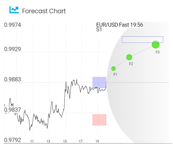
You can see above an example of a Forans Live Forecast chart.
- The left side of the chart shows the recent price line for the asset monitored
- The gray zone defines the area in which prices will develop with a 96% probability
- On the right side is the forecast. Three future prices are predicted for this asset: F1, F2 and F3 represented by three orange circles joined by a line
- Resistance and support are shown only when their strength is significant:
-
- The resistance zone is indicated by a light purple rectangle
- The support zone is indicated by a red rectangle
- The target price level is indicated by an empty rectangle
Each Forecast chart shows a trend ( up, down, flat ) and its price targets.
1.3. Time Horizons
Our servers run permanently the Forans Model on a series of markets and assets (a few hundreds as of today, see full list in appendix) and generate the related Forans forecast charts.
For each market or asset four different forecasting Time Horizons are calculated, ranging from a few hours to above one week:
- Fast Time Horizon: a few hours (can be more for low liquidity assets)
- Medium Time Horizon: up to one day (can be more for some assets, see above)
- Slow Time Horizon: 2 or 3 trading days (up to one week or even more for some assets, see above)
- Extra Slow Time Horizon: one week or more
When you subscribe to the service you will select the markets you want to follow and also the Forecast Time Horizon.
(Note: Slow and Extra-Slow are grouped in a single subscription option)
(Note: Slow and Extra-Slow are grouped in a single subscription option)
Be sure to select the Time Horizon most adapted to your trading style, be it intra-day or slow-paced.
Even if we indicate above some time brackets corresponding to each Time Horizon, this must be taken with caution and realism. In fact the Forans Model is actually forecasting a series of future prices for an asset, in other words a price-path. This path can be followed in a fast or slow way depending on the frequency of the market prices update.
As not all assets have the same liquidity, a given Time Horizon can correspond to widely diverse effective time frames, but always short-term. The level of activity (liquidity) on an asset is also variable from a day to another, or during a single trading day. However when you follow a liquid asset market with attention, because maybe you have an open position, you will notice when it is speeding and when it is slowing.
This fluid nature of the markets is why we labelled the Time Horizons as Fast and Slow in the app, rather than near and far. The Time Horizon scale is therefore not strictly time-related but rather market-activity and price-frequency related.
Note:
You can see in the Forans chart, that the vertical bands shown on the left (the historical prices) that correspond to the single hours, may have a variable width. This is linked to the market price activity during that specific hour.
You can see in the Forans chart, that the vertical bands shown on the left (the historical prices) that correspond to the single hours, may have a variable width. This is linked to the market price activity during that specific hour.
2. The Forans App
The Forans App can be downloaded from PLAY STORE
Once subscribed you will receive information details to access the selected markets and Time-Horizons.
With the Forans app you have access to the Forans Model forecasts through two modalities: Trading Signals and Live Forecasts.